BEFORE AND AFTERS
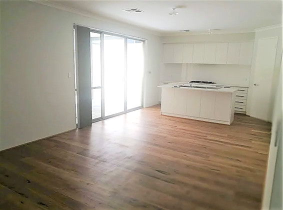
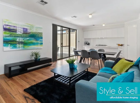
Staging a new build
In this new build, the lack of furniture made it difficult for the buyer to picture how large the space really was, and how it could be used. The result was a warm, inviting family area.
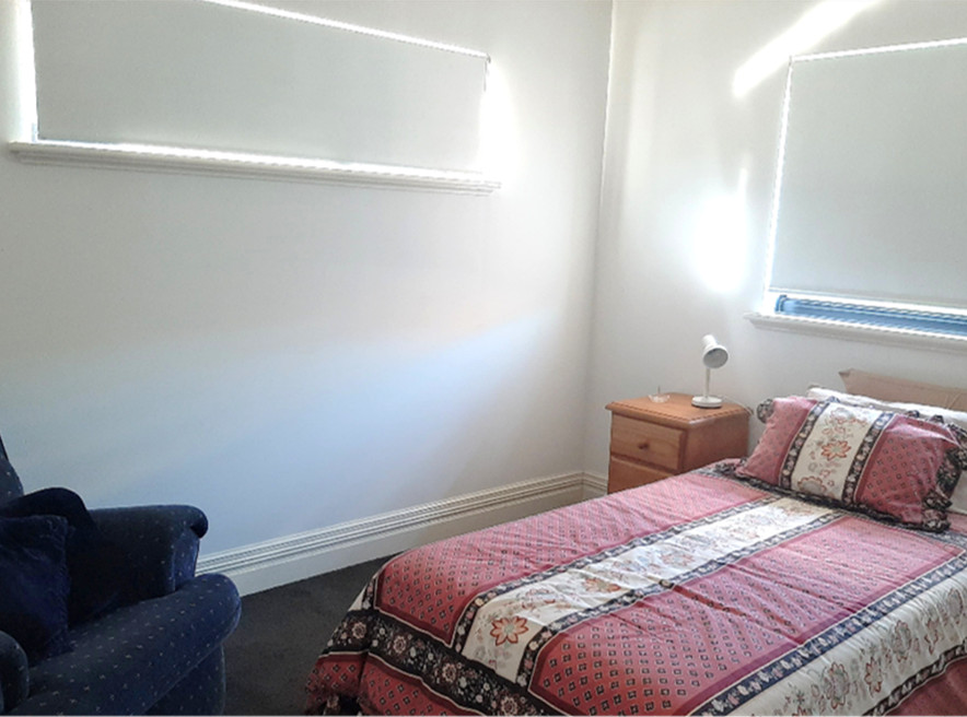
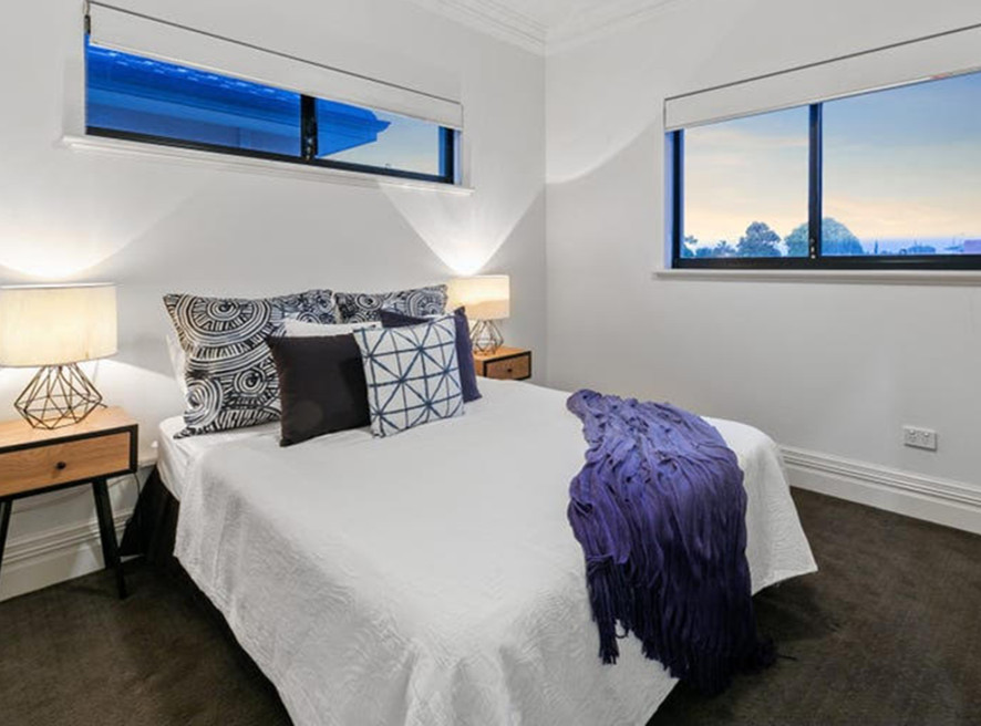
Brightening a small, tired bedroom
In this bedroom, the challenge was a poor layout and dated furniture. By switching out the bedding and furniture placement the room looked larger and complemented the stunning water-view location.
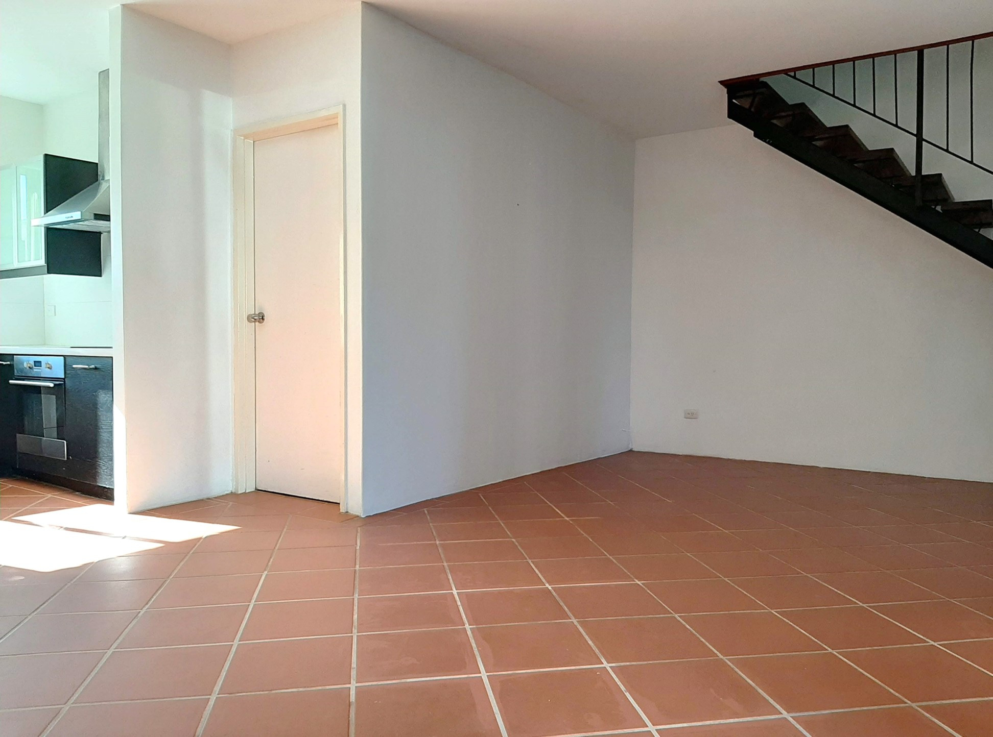
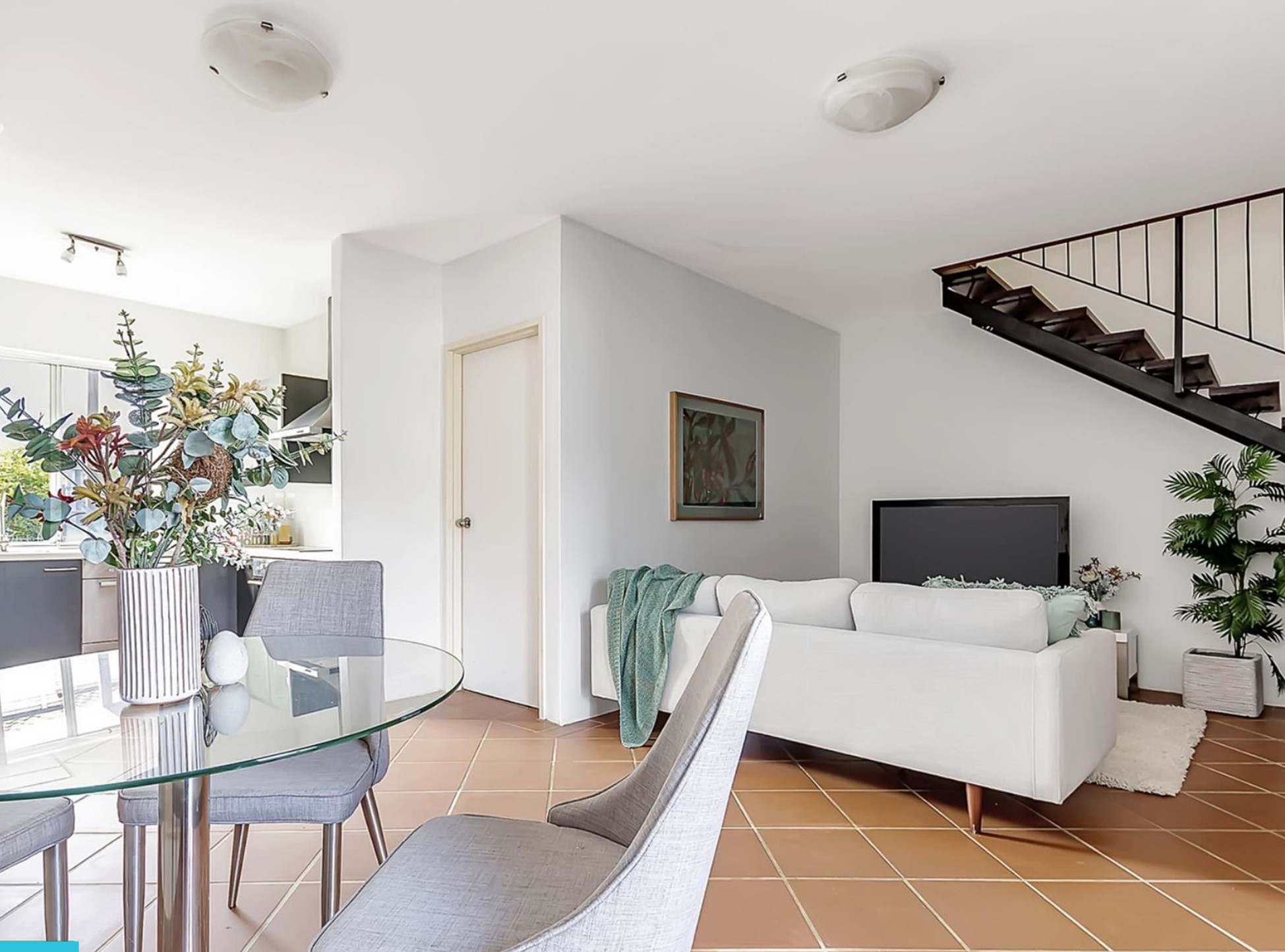
Fixing an awkward layout
In this townhouse, we created a cozy nook for the lounge dining area to draw attention from an imposing staircase.
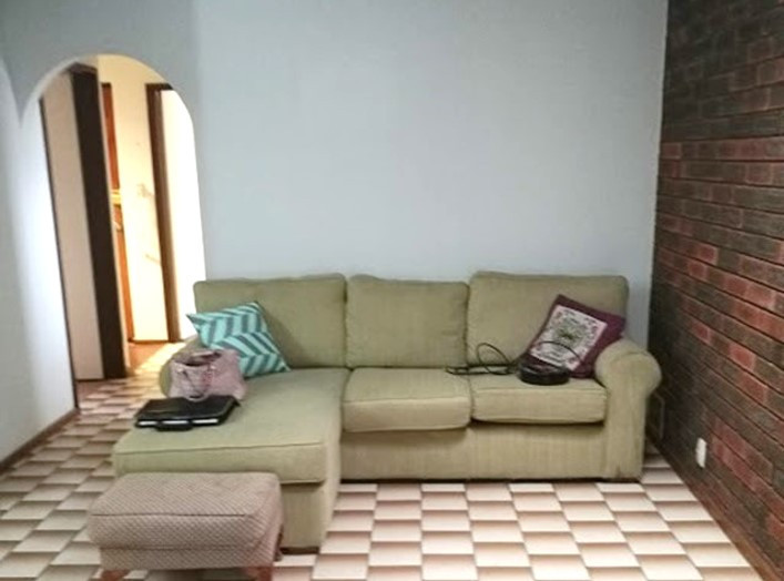
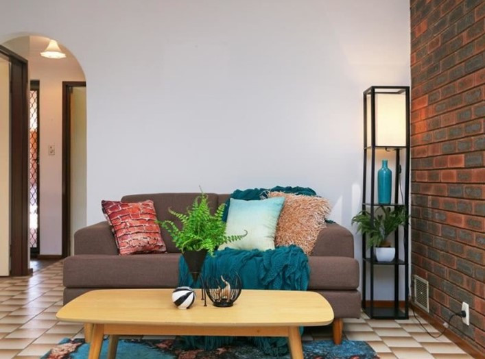
70's tile and decor
This was a cool property that had some pretty assertive tile to deal with! By going with the era and giving it a modern twist, the room regained some street cred.
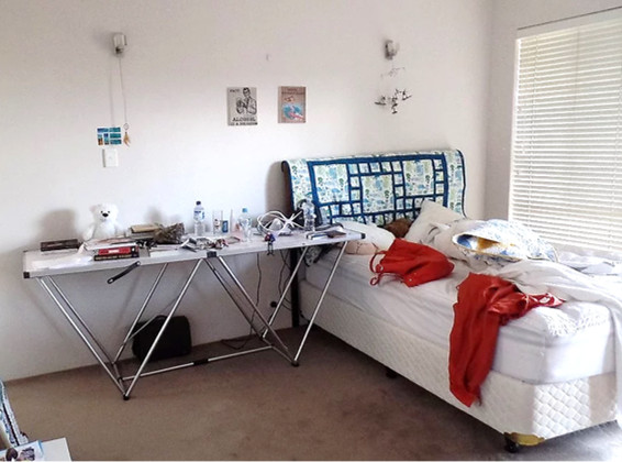
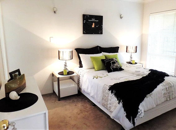
Beneath the clutter...
The clutter hid the potential of this generous bedroom space. Our clients often come to us to help them let go of superfluous items - and in the process, get a head start on packing for their new home!
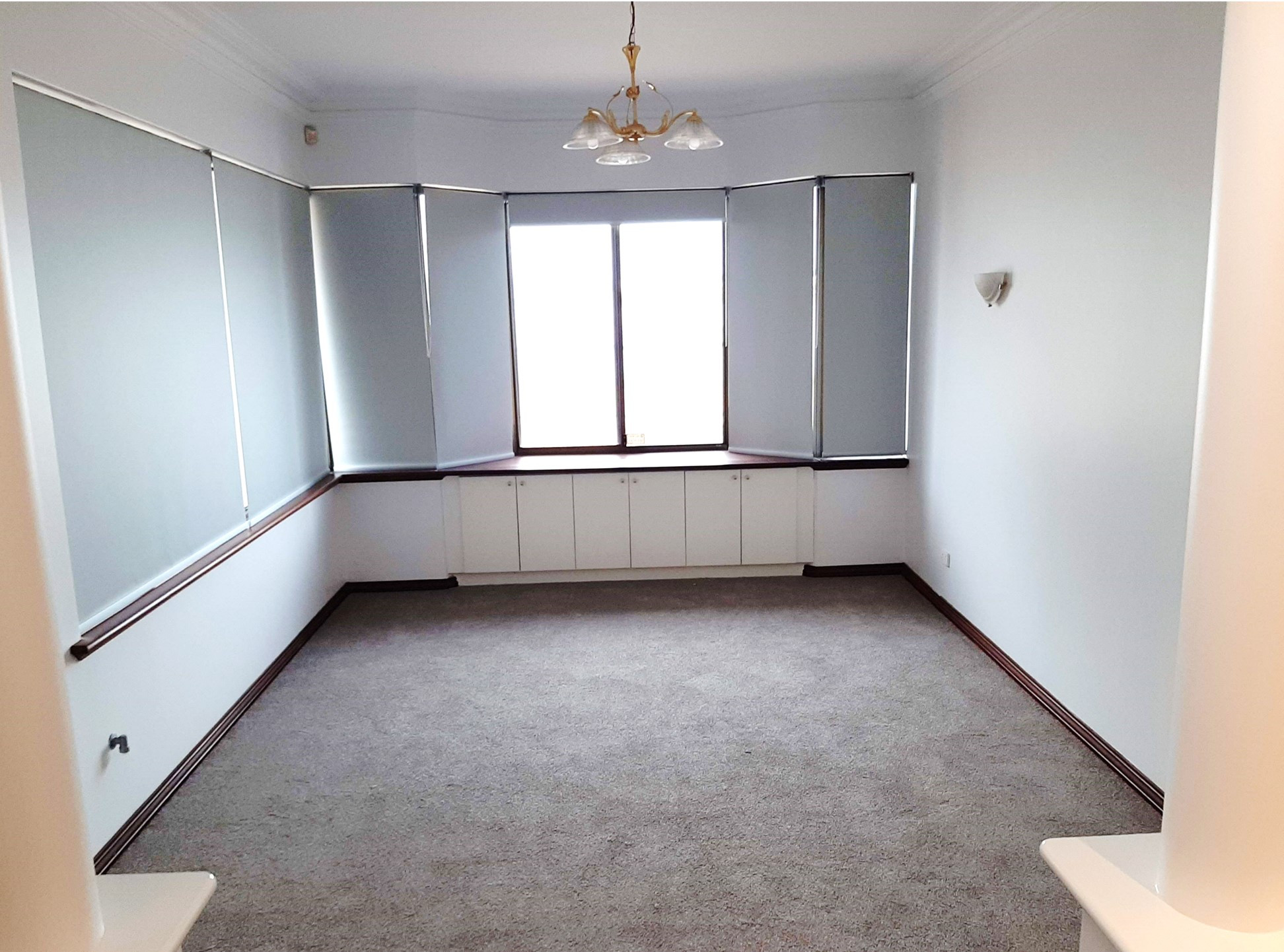
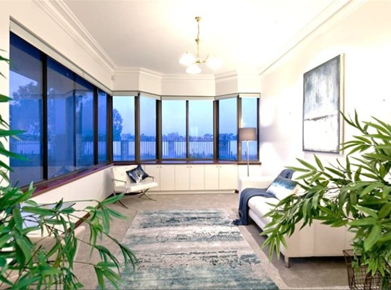
Making the most of a stunning view!
This under-utilised space was begging for staging. Potential buyers had no problem seeing themselves enjoying the view once we had styled the space.
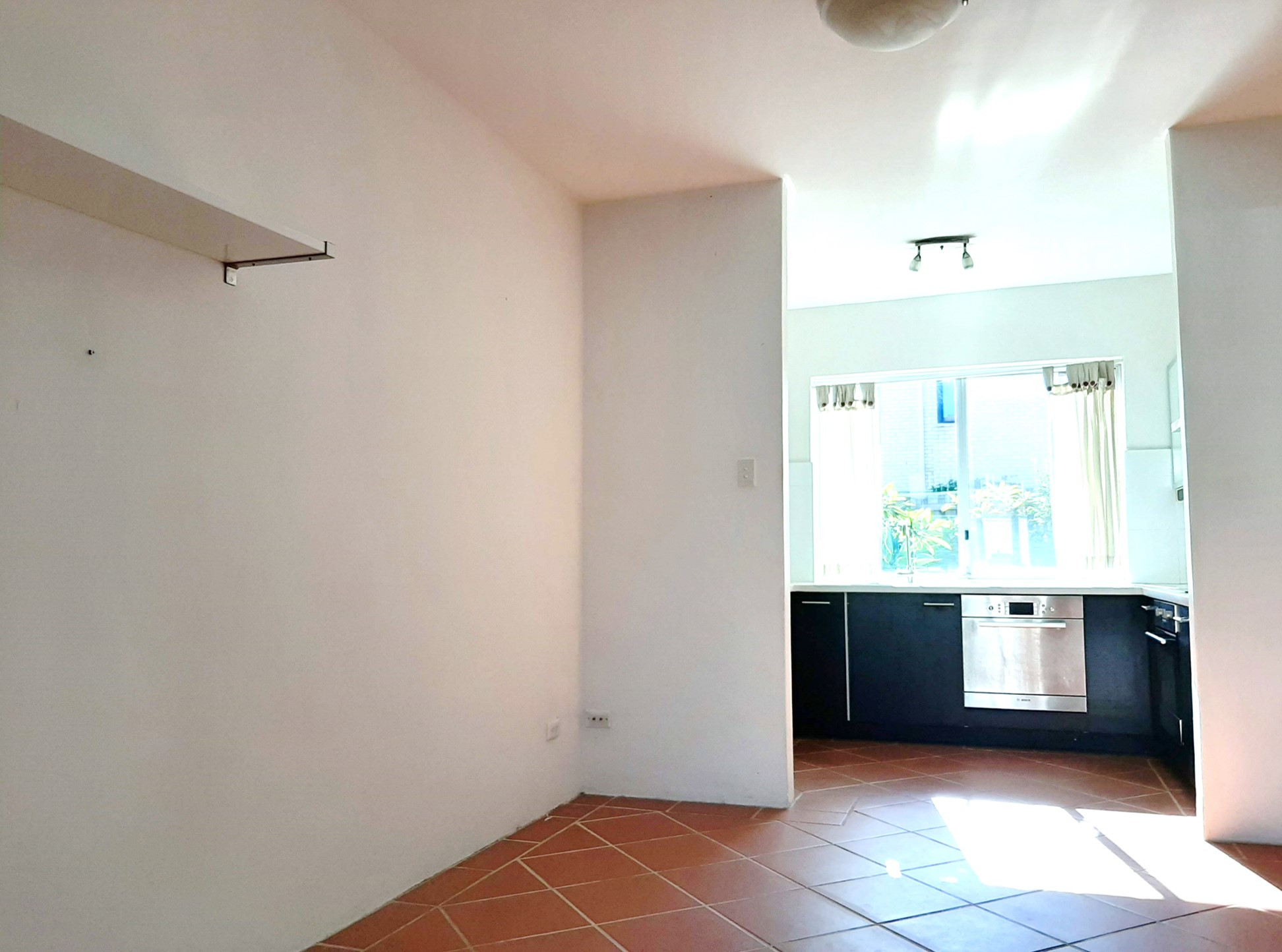
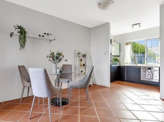
Warming up the space
It was hard to get excited about the kitchen dining area when it laid empty. The addition of furniture made it a delightful, "lived in" space!
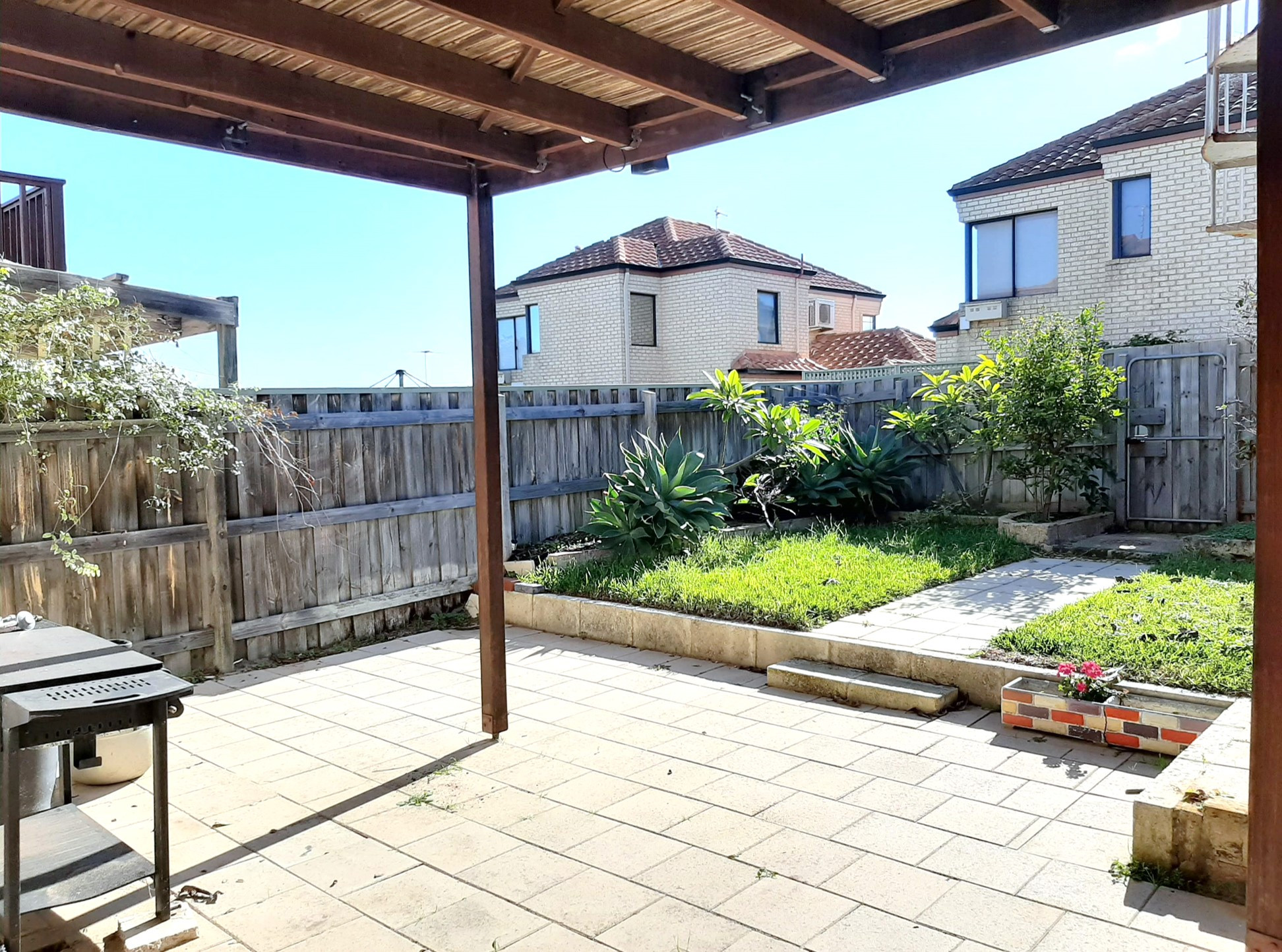
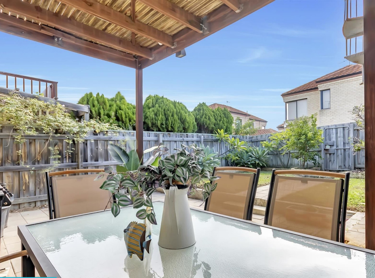
Somewhere to throw a prawn on the barbie
Staging took an ugly duckling back patio and turned it into an inviting outdoor dining space. Who doesn't love a backyard BBQ?
